The Canadian Press charts library
Built and maintained by Lucas Timmons
Use this library to find the type of chart you'd like to use. Click through to see a demonstration of the chart and to see how you should format your data. When you have made your decision, collaborate with us by emailing Megan Leach and Lucas Timmons. Let us know what you'd like to make and we can get started.
Filter
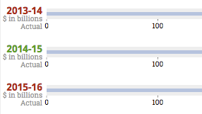
A bullet graph is a variation of a bar graph. Inspired by the traditional thermometer charts and progress bars, the bullet graph serves as a replacement for dashboard gauges and meters. The bullet graph features a single, primary measure (for example, current year-to-date revenue), compares that measure to one or more other measures to enrich its meaning (for example, compared to a target), and displays it in the context of qualitative ranges of performance, such as poor, satisfactory, and good.
Good for: Budgets, meeting targets
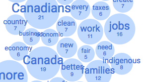
A frequency chart with the data represented as the size of a bubble element. Like a word cloud, but better because it maintains fidelity of relative size and offers the actual frequency count.
Good for: Speeches, text analysis
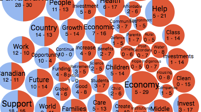
A frequency chart with the data represented as the size of a bubble element. The bubbles are split between two datasets to show how frequent a common term appears for each set. It's like a word cloud, but better because it maintains fidelity of relative size and offers the actual frequency count.
Good for: Speeches, text analysis, text comparison
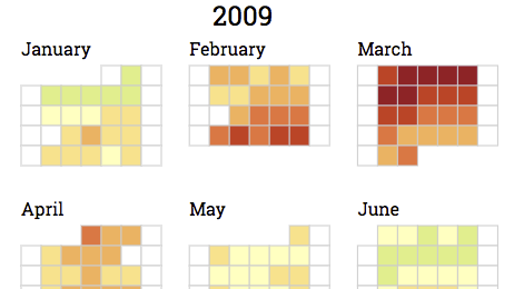
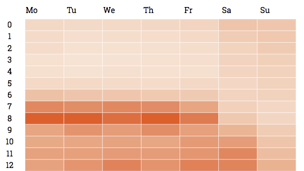
A graphical representation of data where the individual values contained in a matrix are represented as colours. Used to show frequency over a particular date and time.
Good for: Tweet analysis, donor analysis, stock prices, transactions by day, anything that can be tracked daily
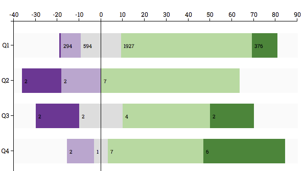
Uses horizontal bars to show comparisons among categories. One axis of the chart shows the specific categories being compared, and the other axis represents a discrete value. Here they are grouped to add to 100%. The 0 of the horizontal axis in this chart moves based on positive or negative answers.
Good for: Typical poll results
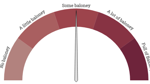
A graphic showing value as how far along the needle is along a scale.
Good for: Pointing out where something is on a defined scale
Uses horizontal bars to show comparisons among categories. One axis of the chart shows the specific categories being compared, and the other axis represents a discrete value. Shows one data set only.
Good for: Comparing discrete values that aren't percentages
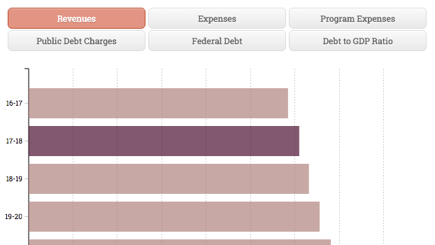
Uses horizontal bars to show comparisons among categories. One axis of the chart shows the specific categories being compared, and the other axis represents a discrete value. Switches between multiple data sets.
Good for: Comparing discrete values that aren't percentages
A graphical representation of data where the individual values contained in a matrix are represented as colours. Used to show frequency over a particular date and time.
Good for: Tweet analysis, donor analysis, stock prices, accidents by hours of the day, anything that can be tracked by day and hour
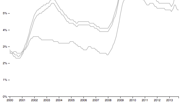
Displays information as a series of data points connected by straight line segments. Similar to a scatter plot except that the measurement points are ordered (typically by their x-axis value) and joined with straight line segments.
Good for: Visualizing a trend in data over intervals of time when you have many datasets or data points
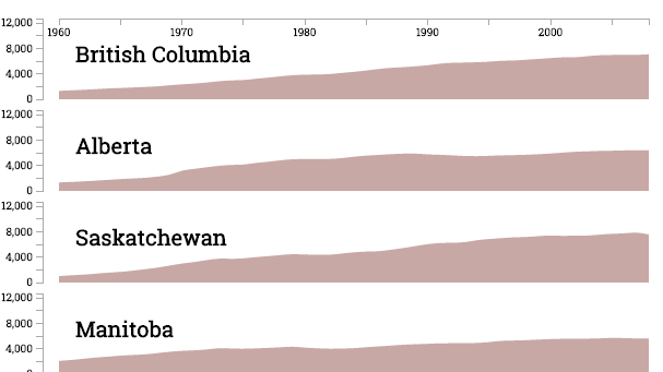
Displays information as a series of data points connected by straight line segments creating a filled in area. Similar to a scatter plot except that the measurement points are ordered (typically by their x-axis value) and joined with straight line segments.
Good for: Visualizing a trend in data over intervals of time when you have a few datasets
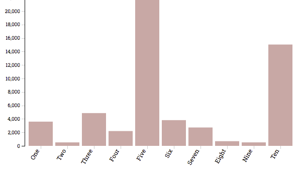
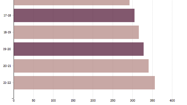
Uses vertical bars to show comparisons among categories. One axis of the chart shows the specific categories being compared, and the other axis represents a discrete value. Shows one data set only.
Good for: Comparing discrete values that aren't percentages
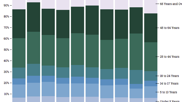
Uses vertical bars to show comparisons among categories. One axis of the chart shows the specific categories being compared, and the other axis represents discrete values adding to 100%.
Good for: Comparing discreet values that are percentages and add to 100%
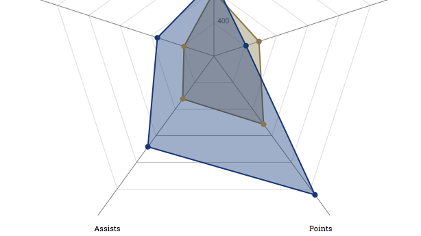
Displaying multivariate data in the form of a two-dimensional chart of three or more quantitative variables represented on axes starting from the same point. The relative position and angle of the axes isn't informative.
Good for: Comparing two things based on shared statistics or values
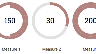
Displays data based on a total of a normalized percentage using a circle.
Good for: Comparing data that goes over 100% in one point and under 100% in another
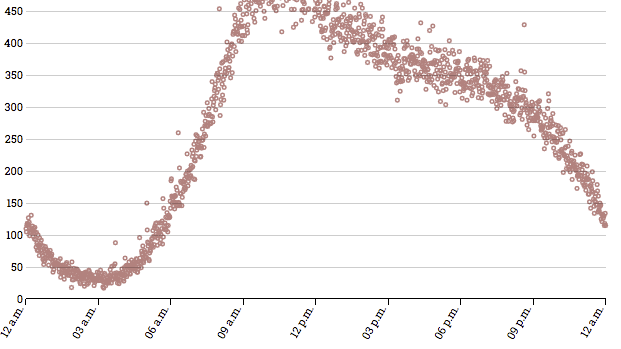
Uses Cartesian coordinates to display values for two variables for a set of data.The data is displayed as a collection of points, each having the value of one variable determining the position on the horizontal axis and the value of the other variable determining the position on the vertical axis.
Good for: Showing where and when
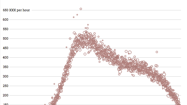
Uses Cartesian coordinates to display values for three variables for a set of data. The data is displayed as a collection of points, each having the value of one variable determining the position on the horizontal axis and the value of the other variable determining the position on the vertical axis. The size of the point can be used as a third variable about the data.
Good for: Showing where and when and how much
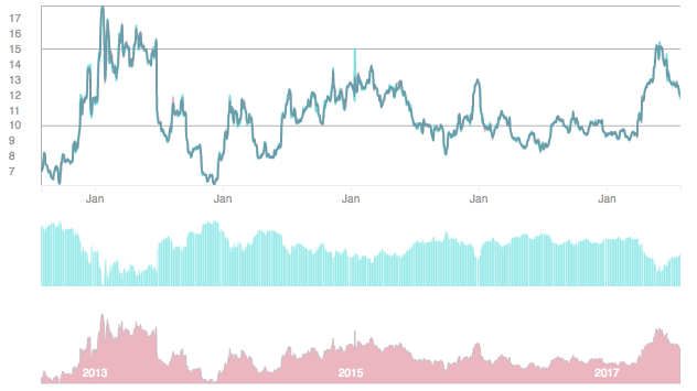
Shows a stock's performance over time. The first chart shows the close price in cyan and the mean daily price in magenta. The second chart shows the daily volume. The third chart is a brushable area chart. Click and drag to adjust the zoom on the two charts above.
Good for: Showing how well a stock performed over the past five years
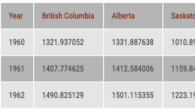
A responsive data table. Much like a spreadsheet.
Good for: Comparing data where a chart would make the analysis less clear
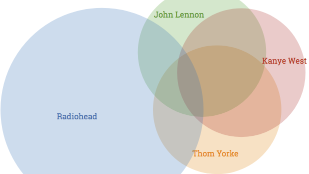
A diagram that shows all possible logical relations between a finite collection of different sets. Consists of multiple overlapping circles, each representing a set. Shows all possible relations between the sets.
Good for: Comparing overlapping data
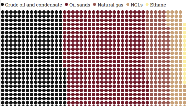
Essentially a squarified pie chart. Since it does not involve angles, it’s easier for the reader to compare accurately as well as evoke emotional comparisons.
Good for: When you really want to use a pie, but know you shouldn't